
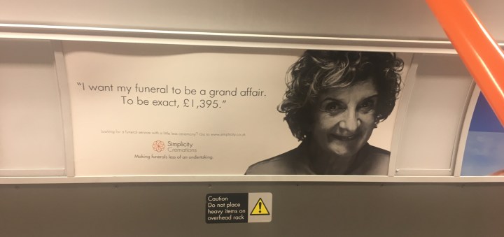
I found these two adverts for Simplicity Cremations while travelling home last week. Compared to the advert that was banned last summer, (seen in my previous blog post), it is interesting to compare the two styles and see why this one is socially accepted. Perhaps because the people on the cover are (a) old and (b) seemingly cheerful. The text is in the first person, suggesting a sense of agency that the elderly person depicted is declaring their intentions. The smiling faces seem to acknowledge the process of death. This advert is mostly monochrome, and is much calmer in comparison to the colour scheme of the banned advert, which was saturated and depicted a vibrant, almost chaotic image. In particular, the banned advert featured people who were very much alive and in their youth, whereas the characters featured above seem to cultivate a greater sense of empathy from the audience, being of the age that they might be using this service. Evidently, adverts for services for the ageing/dead body must represented the body in a agentive manner to avoid provoking reactions to the death taboo.
